The Role of Color in Web Design
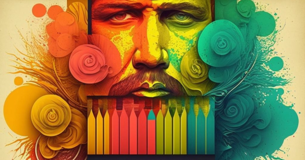
Table of Contents
What Are the Best Colors for Web Design?
In web design, color does much more than just decorate. It plays a crucial role in how users feel and interact with a website, influencing its overall success. So, what colors work best for websites? In this article, we dive into the importance of color in web design and offer advice on choosing colors that craft an unforgettable online presence.
The Psychology of Color in Web Design
Before diving into the best colors for web design, it’s important to understand the psychology behind color. Colors can evoke different emotions and feelings in people, and it’s crucial to choose the right color scheme to match your website’s purpose.
For example, blue is often associated with trust and security, making it a popular choice for financial and technology websites. On the other hand, red is a bold and attention-grabbing color that can create a sense of urgency, making it ideal for e-commerce sites that want to encourage sales.
Other popular colors and their associated emotions include:
- Green: Growth, health, and relaxation
- Yellow: Happiness, optimism, and warmth
- Orange: Creativity, enthusiasm, and excitement
- Purple: Luxury, wisdom, and spirituality
When choosing a color scheme for your website, think about the emotions and feelings you want to evoke in your visitors. Are you trying to create a sense of trust and security, or do you want to inspire excitement and enthusiasm?
Using Colors to Create a Memorable Online Experience
Now that we understand the psychology behind color, let’s dive into how to use colors to create a memorable online experience. Here are some tips to keep in mind:
- Choose a cohesive color scheme: Your website’s color scheme should be consistent across all pages and elements, from the background color to the buttons and links.
- Use contrast to your advantage: Contrast helps to make your content stand out and can guide your visitors’ eyes to important elements. For example, using a bright color for your call-to-action button can encourage visitors to click.
- Consider accessibility: Make sure your color scheme is accessible for all users, including those with color blindness or other visual impairments. Use tools like the WebAIM Color Contrast Checker to ensure your colors meet accessibility standards.
- Keep it simple: A cluttered color scheme can be overwhelming and distract from your content. Stick to a simple color palette of two to three colors to create a clean and cohesive look.
- Test and refine: Don’t be afraid to experiment with different colors and combinations. Use A/B testing to see which color schemes perform best and refine your design accordingly.
Conclusion
The role of color in web design cannot be overstated. By understanding the psychology of color and using it to your advantage, you can create a website that is not only visually appealing but also memorable and effective in achieving your goals. Remember to choose a cohesive color scheme, use contrast to guide your visitors’ eyes, consider accessibility, keep it simple, and test and refine your design. By following these tips, you’ll be well on your way to creating a successful and impactful online presence. If you need help with picking a color scheme for your new website feel free to contact us!
Frequently asked questions
Why Color and not Colour?
In web development and more specifically coding everything is based on the American language model. hence why we are using color in this post.
What is the role of color in web design?
Color plays a significant role in web design as it can impact the overall user experience of a website and contribute to its success.
What is the psychology behind colors in web design?
Colors can evoke different emotions and feelings in people. It is crucial to choose the right color scheme to match your website’s purpose. For example, blue is often associated with trust and security, while red is a bold and attention-grabbing color that can create a sense of urgency.
What are some popular colors and their associated emotions in web design?
Some popular colors and their associated emotions in web design include green for growth, health, and relaxation; yellow for happiness, optimism, and warmth; orange for creativity, enthusiasm, and excitement, and purple for luxury, wisdom, and spirituality.
How can one use colors to create a memorable online experience in web design?
To use colors to create a memorable online experience, one should choose a cohesive color scheme, use contrast to guide visitors’ eyes, consider accessibility, keep it simple, and test and refine the design.
How can one ensure accessibility for all users in web design?
To ensure accessibility for all users in web design, one should use tools like the WebAIM Color Contrast Checker to ensure the colors meet accessibility standards, and consider the needs of users with color blindness or other visual impairments.